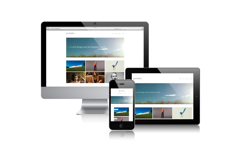
Responsive web design. What is it? Ideally it provides an optimal viewing experience.
Take your mouse (if your on a desktop), grab the bottom right hand corner of your browser window and change it’s size, making it much smaller and very narrow. It may seem more obvious if you move to the folio section. Notice the content re-distributing itself on-screen to best suit the browser width. That’s responsive web design. Obviously on a tablet or smart phone you cannot re-size your browser, and you are already seeing the end result.
I have read much on this. Some say it’s the best thing yet. Some are not big fans. The big argument against seems to be that content (for example the sidebar on a blog) may move to the bottom of the screen at narrow screen sizes. Well that’s ok with me. The incredibly vast range of screen sizes available today (both landscape and portrait) make holding onto that rule seem fairly silly.
What do I think? I think it’s great. Personally I agree with the ideal that the less you need to pinch and zoom whilst browsing on smaller screens (smart phones), the more enjoyable, and most likely legible the experience. So that’s good. A single content source makes a lot of sense too. And with predictions floating around that the majority of people will be browsing on devices long before the end of 2015, responsive makes sense.
So how is it done? Via media queries, which are additions to your CSS stylesheet. Browser detection (yes a browser knows what type or size device you are using), results in a different styling characteristics being set. Simple. Amazing. Way to go Zeldman.